

The mise-en-scene of the video was important to us as it was one of the main factors in a lot of our research. We saw lots of videos that used big cities and skylines in their mise-en-scene, therfore we decided to go up to London and film in certain iconic locations such as; Regents park and Southbank, so that the audience may connect more with the video. We had a little trouble with this as we were told that we weren't allowed to use a tripod in a few places therefore we had to film freehand, however we still managed to get some good footage.
For the costume we decided to use casual outfits so that it would engage with the audience much more. In our reseach most of the cothing used was very simple and ordinary, therefore we used dark colours and everyday costumes to follow the same style and fit in.
For the live shots we decided to make them black and white due to some lighting issues and the shots not matching up. We had seen this in one of our reserch videos already, however we thought that it would be more interesting to keep the storyline footage in colour and have a bit of both.
Altogether it worked really well and we tried to follow some of the coventions that we found in our research, however we also tried to add our own style on to it as well.
Poster -
When making the poster we tried to use the conventions that we had researched when planning our own design. We tried to stick with a simple layout and decided to have the image as the main focus point, just like many posters that we looked at, we also kept the coulour design the same as the CD with lots of natural colours and not too bright. This was so that it would fit in with the style and genre of the music and appeal to our target audience.
We also found in our reseach that most promotional posters use an image of the CD cover so that the CD was recognisable to the audience. We thought that this was a good idea so we added the front cover of our CD onto our poster so that people could tell what it was advertising.
CD Front Cover-
For the front cover we made sure that the image was the focus of the design so that the audience would know who's music it was straight away. We used natural colours instead of bright ones so that it fitted in better with the style and genre of the music and what we had researched.
We tried to keep the rest quite simple, like the text and the background as the research that we had done was all about the image and not overcrowding, therefore we followed this style.
Inside Left -
For the inside we had researched different layouts and found the ideas of a personal message, song lyrics or another image. We decided to write a message from the artist to engage with the audience and make it more appealing to them. We thought that this followed nicely with the style and type of artist that we were using as it fitted well with the genre.
Inside CD -
CD Back Cover -
H
For the back, again we found a lot of CD's from our research and the same type of genre, kept a very simple layout. Therefore we decided that the track list should be the focus point and we experimented with some different patterns and designs to add something extra. We kept the colour design just like the rest of the CD and we also added a barcode and copyright text at the bottom as we had seen it in a lot of our research.
Overall I think that we used the forms and conventions to give us an idea of what we should do in terms of layout and design, in order to attract our target audience. We developed a few of these conventions and added our own style to fit the artist as well as following what we thought would look right in order to look as professional as possible.
Question 2 - How effective is the combination of your main product and ancillary texts?

We tried to keep both ancillary texts similar so that they would become recognisable to the audience and they would be able to tell that they are linked. We kept the font and colour design very similar and used natural colours to fit in with the genre of the music video. The plain background on the CD cover helps to connect with the simple black and white in the video as they are both very minimalistic. We also used desaturation in the main product as well as the ancillary texts as we found that this was used in a lot of the productions that we researched. This was so that they both linked together and didn't contrast in colour design too much. We used different images for the poster and the CD however they were taken in the same photoshoot and therefore look similar as he is wearing the same clothes and the same mise-en-scene as well as the layout being very similar. This meant that the audience were able to connect much more to the artist as he was in normal everyday costumes that didn't differ too much or distract from the acoustic style of the music and the storyline.
The target audiences are the same for the CD and promotional poster as well as the music video therefore we had to keep them very much the same so that the style of all three would appeal to the same audience. This is also helpful with the promotion of the music video as everything is associated with the artist and the products will become much more distinguishable to the public. It also means that they are mush more iconic to the audience and more people will recognise them meaning that they will spread to the demographic that we were aiming to reach. I believe that the poster really helps to understand the CD and they work well together as there is an image of the front cover on the poster so that it is recognisable to the audience. We also named the CD after the song in the music video so that people would know it is connected and that they are both part of the same product.
Question 3 - What have you learned from your audience feedback?

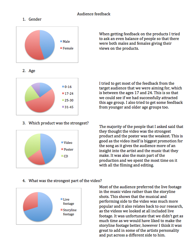

Overall people really liked our productions, however if we could change anything it would have been making sure that we filmed the live footage in the same day so that the lighting wasn't different between shots. We would have also picked a few more locations for the storyline of the film to make it more of a progression of their relationship. I think that if we had more time we could have worked on both the CD and the poster a bit longer and taken some more photos to put on them so that they weren't as simple. Altogether I am very happy with the overall productions as they look professional and the feedback was very positive.
Question 4 - How did you use new media technologies in the construction and research, planning and evaluation stages?
We used a variety of media technologies when making our music video. Including, different hardware such as cameras and video cameras, as well as software such as Final cut and Photoshop. We also used other programmes to complete our research in the early stages.
In our planning stages we looked at a wide range of music videos to get more ideas for genres and styles so that we had enough ideas when making our own. We used YouTube to gather research and to find out the forms and conventions that many music videos follow so that we could then follow these or challenge them when making our own products. We found out a lot about the context and delivery that we had to take into account when planning out own and how we should display the video and the other products. We also used YouTube to upload our animated storyboard in order to help us learn more about our timings and what shots we were planning on carrying out. We also uploaded our final music video once we had completed it, which helped others to view it easily and give feedback on it so that we knew what we could improve and what the strengths were.
For the filming of the video we borrowed video cameras from the college, which we then took to the locations that we had planned to use. It was our first time filming on our own; therefore we had to learn how to operate them and what to do to get the best footage possible. We managed to take the hardware to London and use them in the city. We had a little bit of difficulty at first as we were still getting used to how the cameras work, however we soon learnt and we were able to get some good footage.
We also used a digital camera to take the images for the CD and the poster. We took a variety of shots so that we had a good selection to work with when it came to editing the products. We made sure we planned the photoshoot before hand so that we knew the positions and placements of the pictures that would work well. We had a few issues with the lighting and the background that we wanted to use, however when it came to the editing of the pictures we cut out the background as they didn't look professional enough to begin with.
When editing the music video we used Final cut which was difficult at first as we hadn’t used it before. We had a few difficulties with timings and putting all the footage together along with the audio track; however we soon managed to sort it out and get used to the software. We also had some issues with lighting in the live shots as we filmed on two different days and the lighting was different on the second time. We therefore decided to make the clips black and white which turned out to look much more professional. We still had issues with lighting but we managed to make it better by adjusting the levels in final cut so that the shots looked near enough the same.
We then used Photoshop to make the CD and the poster. We edited the colouring and the images, added textured backgrounds as well as text. We found it a lot easier making the ancillary texts than the main production as we had already used Photoshop before.
We documented all of our work and progression on blogger which was difficult to figure out at first but once we got used to it, it was simple. It really helped us to see all of or plans as well as being able to go back to the research that we had carried out, to compare our work. It was easy to see the progression of our project and what we had completed as well as what we still had left to do.


